
Welcome!
Ready to learn how to create amazing artistic compositions on your iPhone, iPad, or Android phone or tablet?
Below you will find three exciting lessons with internationally acclaimed IPPA 2013 iPhoneography Artist of the Year Bob Weil, co-author of The Art of iPhone Photography: Creating Great Photos and Art on Your iPhone, and celebrated instructor at www.iPhonePhotoArtist.com
Two of the lessons below include videos (the second lesson has five videos itself), while the third is written out for you with screen-captures so you can follow along.
Work through all three lessons, taking the time to try out the ideas yourself. You are going to be astonished at the artistic wizardry you will be able to perform by the end. Once you have these skills, your life will never be the same. Because with such artistry at your fingertips, a whole world of creativity is about to open up to you.
And if you love what's here, be sure to check out the incredible online course Bob Weil provides, with dozens of training videos and a wealth of content — which you can grab right now at nearly half off through the special promotion you will find at the bottom of this page. Don't miss out!
And if you love what's here, be sure to check out the incredible online course Bob Weil provides, with dozens of training videos and a wealth of content — which you can grab right now at nearly half off through the special promotion you will find at the bottom of this page. Don't miss out!
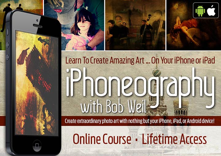
Lesson One
The World of iPhoneography:
Thinking Like a Photo Artist
Duration: 6 min 22 sec. Give the video time to buffer. It's been stored in high-res so that you can click the full-screen button and see it larger without it getting blurry. If you view it in full-screen and want to return to this page, just hit escape (Esc).
In this video ...
You will gain insight concerning shooting candid images and looking to capture those stray moments that will make up your most interesting compositions. You will learn to think through the ideas you want to share, while leaving your viewers to find their own meanings as well. And you will get an in-depth look at the creation of the photo-collage work entitled "The Upper Limits of Human Calculus."
complete online iPhoneography course:
Lesson Two
iPhoneography Step-By-Step:
Creating "Terremoto Diabolico"
Part 1:
Duration: 8 min 29 sec. Give the video time to buffer. It's been stored in high-res so that you can click the full-screen button and see it larger without it getting blurry. If you view it in full-screen and want to return to this page, just hit escape (Esc).
In this video ...
You will get your first look at the step-by-step process in creating a serious photo collage on your smartphone or tablet, including cropping & rotating, layering & texturing, adding type, and resizing for print. You will also get a good initial look at the app Photogene.
Part 2:
Duration: 8 min 32 sec. Give the video time to buffer. It's been stored in high-res so that you can click the full-screen button and see it larger without it getting blurry. If you view it in full-screen and want to return to this page, just hit escape (Esc).
In this video ...
You will continue with the composition, moving on to the incredible app Superimpose. The techniques here are critical to serious photo-collage work. You will begin with loading one image over the top of another, resizing and repositioning the image, adjusting the transparency to match tonal range, and using the Magic Wand Tool (and Brush Tool) to knock out parts of an image you don’t want, then merging into a single background. Then you layer in a new image and use the Lasso Tool to select the element you want to keep (and the Brush Tool to refine its edge). The result? Infinite artistic possibilities!
Part 3:
Duration: 6 min 1 sec. Give the video time to buffer. It's been stored in high-res so that you can click the full-screen button and see it larger without it getting blurry. If you view it in full-screen and want to return to this page, just hit escape (Esc).
In this video ...
You will continue on with Superimpose and learn to achieve a sense of reality in the elements you are bringing together —through the proper sizing, lighting, and shadow placement. You will also be introduced to the idea of using our selections to create masks we can then save and load later (e.g., re-importing the mask to run different effects on just that selection).
Part 4:
Duration: 9 min 36 sec. Give the video time to buffer. It's been stored in high-res so that you can click the full-screen button and see it larger without it getting blurry. If you view it in full-screen and want to return to this page, just hit escape (Esc).
In this video ...
You will move your image over into Leonardo (a fantastic layering and filter effect app) to apply some filters: in this case, a texture with vignette and coloration. We then open the result in Pixlr Express (a great favorite) and apply further effects (here a vintage colorization) to unify the look and feel of your composition and make it all the more realistic. Finally, we jump over to Lo-mob, a great app for giving your image a vintage film effect (here a 35mm film format).
Part 5:
Duration: 7 min 38 sec. Give the video time to buffer. It's been stored in high-res so that you can click the full-screen button and see it larger without it getting blurry. If you view it in full-screen and want to return to this page, just hit escape (Esc).
In this video ...
You will use the exceptional typography app Over to bring in a custom font and layer in some of your own text. Then you will jump into Photoshop Touch to remove any unwanted elements in the image with selections and the clone tool. (Note: see the app notes below regarding the discontinuation of Photoshop Touch, which has effectively been replaced with the app Photoshop Fix.) Finally, we move to Filterstorm, here specifically with the purpose of up-sizing your image to a printable resolution.
Additional Resources:
The specific font referenced in this lesson is called "Faith Collapsing," which can be found here: http://www.dafont.com/faith-collapsing.font That site (http://www.dafont.com) is a great source for viewing and collecting various free fonts for use in your photo artistry. Two other great free font resources worth checking out would be http://www.fontspace.com/ and http://www.urbanfonts.com/
The Apps You Saw Used In This Lesson:
Android Alternative: Photo Editor
Android Match: Superimpose
Android Alternative: Photo Editor
Android Match: Pixlr Express
Android Alternative: Cameringo - Effects Camera
Photoshop Fix (the new Photoshop Touch alternative)
Android Alternative: Touch Retouch
Note: In May, 2015, Adobe unfortunately discontinued Photoshop Touch. If you've previously downloaded the Photoshop Touch app, you will be able to continue to use it without issue until a future version of the Apple iOS (potentially) causes it to stop working altogether. If you don't have Photoshop Touch, after watching the previous videos, you can either make use of the apps Superimpose or Photoshop Fix or (on Android) Touch Retouch, all linked above.
Android Alternative: Photo Editor
complete online iPhoneography course:
Lesson Three
Creating an Artistic Portrait
This straightforward tutorial will show you how to crop and refine an image to suggest an artistic portrait. These techniques can be applied to any candid capture. In most cases, I take a picture, and process it on my iPad. All of the apps used below are available for the iPhone, and the steps are equivalent.
The apps used: Photogene4, Superimpose, Snapseed, DistressedFX, Gradgram (aka Aurora)
Inspiration ...
I’ve always been fascinated by the human face, and I go to great lengths to capture unstudied poses of people going about their day in informal settings. I was sitting in one of my favorite coffee shops, and one of the waitresses mentioned a regular who came in at a specific time each day and wrote out his correspondence, paid his bills and read the paper over the course of the entire morning.
He arrived shortly after I had received my brunch, so I discretely captured a few shots – even edging closer on some pretext to minimize the distance and the number of chairs that separated us. I noticed the toothpick between his teeth as I sat back down, and thought that at least one of these captures could make a fine portrait. The man’s clothing was not at all contemporary looking and the setting would be very hard to date, so I thought I’d give the scene a bit of a vintage look.
(Note: All of the images below are clickable. If you click them, they will open up much larger in a new window so you can see the details even better. You can even right-click this link here and choose to download the original photo I use in this tutorial.)
As is my habit in titling an image, I used Quotationary (on the iPhone) to bring up a quote that I thought would lend additional meaning to the portrait. Since my subject immediately struck me as someone who could be an artist of some kind, perhaps a writer, I searched using those words. (Unfortunately, Quotationary is no longer available, so Bartlett’s Quotations has a comparable app that you can use – you can find it here on iTunes). This is what I selected as a quote:
and the less the artist does the better." - Andre Gide
Step 1: Crop the image
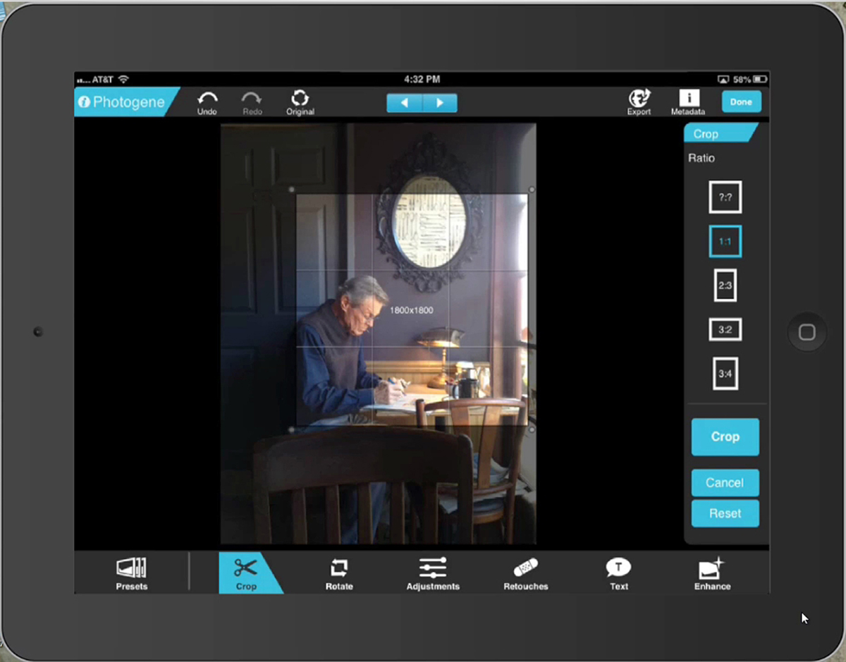
When it’s not possible to properly compose an initial shot (see Figure 1, the original image), it’s imperative to crop the image thoughtfully. I used Photogene4 to crop closely to the man, but leave enough of the scene to provide context, and enough of the window to allow me to make the lighting a key part of the moment.
Step 2: Adjust brightness and saturation
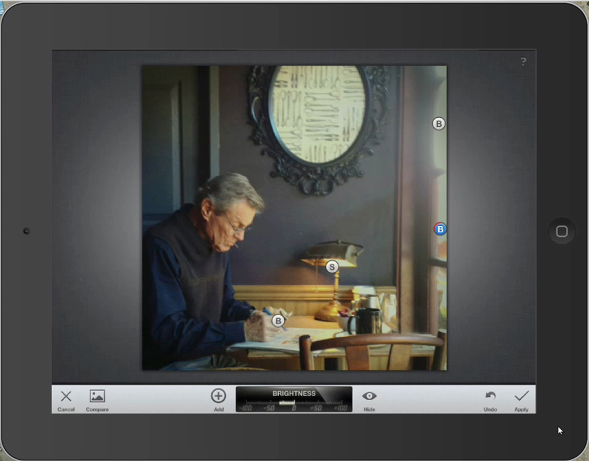
I then opened the image in Snapseed to adjust brightness and saturation. Snapseed is a great general editing program, but one very notable feature is the ability to edit portions of an image by placing adjustment nodes in a particular problem area, using your fingers in a pinching or spreading motion to narrow or broaden a particular effect. Each node can represent brightness, contrast, saturation or other settings. Note the notes labeled “B” and “S” – representing Brightness and Saturation. In particular, the area around the man’s hands were a bit washed out in the light, and I wanted to reduce that effect, and the light in the lamp was too yellow, so I wanted to lower the saturation. The two adjustments at the window were intended to reduce brightness so that the eye was not drawn away from the subject.
Step 3: Create a vintage look
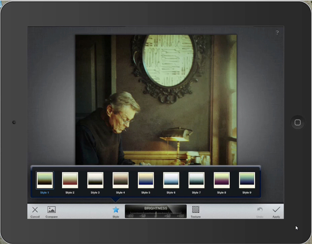
Continuing in Snapseed, I clicked on the Vintage filter option in the navigation on the left, and selected the very first filter – Style 1. This gave the scene a very pronounced sepia tone that suggested the timelessness of the scene by sending it back about 100 years.
Step 4: Add a vignette
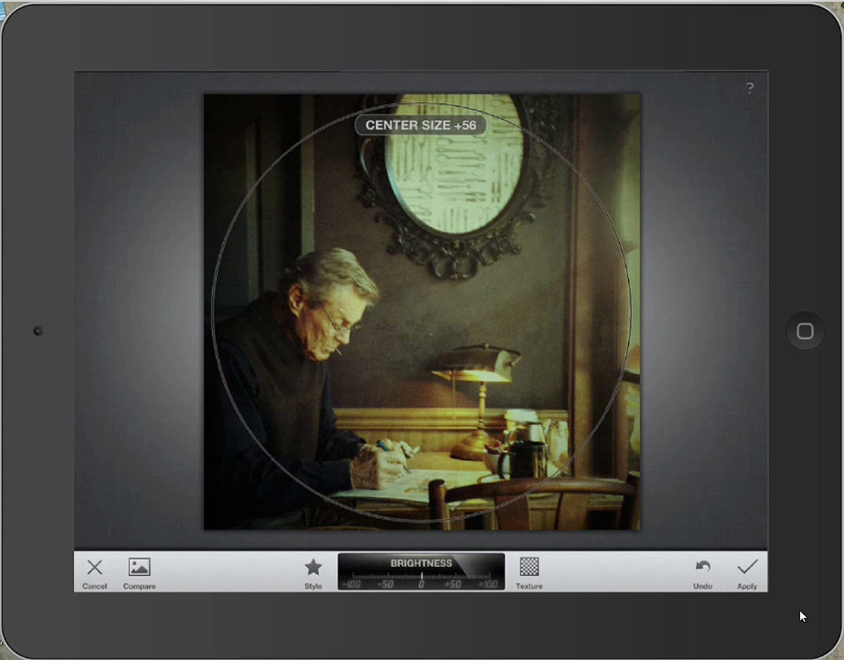
One of the options in any section that includes filters (such as Vintage) is to use a pinch or spread motion with two fingers to increase or decrease the vignetting – and here you can see how I’ve increased the Center Size (Snapseed’s word for vignette focus) to 58.
Step 5: Remove a distraction
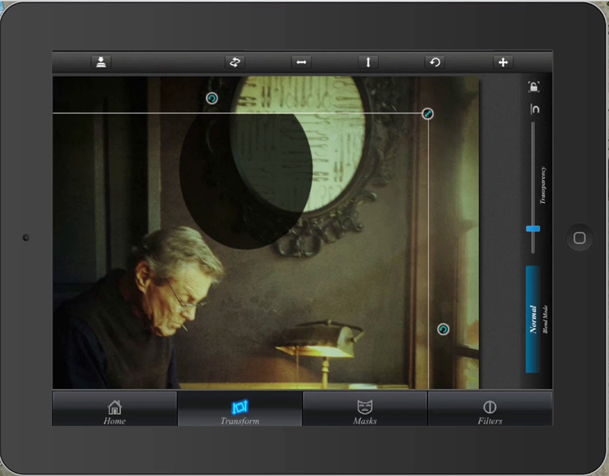
Probably the most distracting element in the original scene is the bad art in the frame above the subject. I decided that I want this to look like a mirror – and since it was out of the direct light, it could be essentially black (suggesting that the remainder of the room behind the viewer is in darkness). I opened Superimpose and then added a layer of black (a photo taken of my finger completely obscuring the lens). Using the marque tool in the app, I selected an oval portion of the image and deleted the rest. I carefully positioned this over the artwork, and using the Multiply blend mode, reduced it almost to black.
Step 6: Refine the tone and vignette
Opening Gradgram (now called Aurora), I use several powerful settings to adjust the coloration of the scene and the nature of the vignette. The entire purpose of this app is to create gradients and vignettes, and provide very specific controls to customize the tonal range of a scene. I continued what I had started in Snapseed, and added more of a sepia tone to the scene.
Step 7: Let there be light
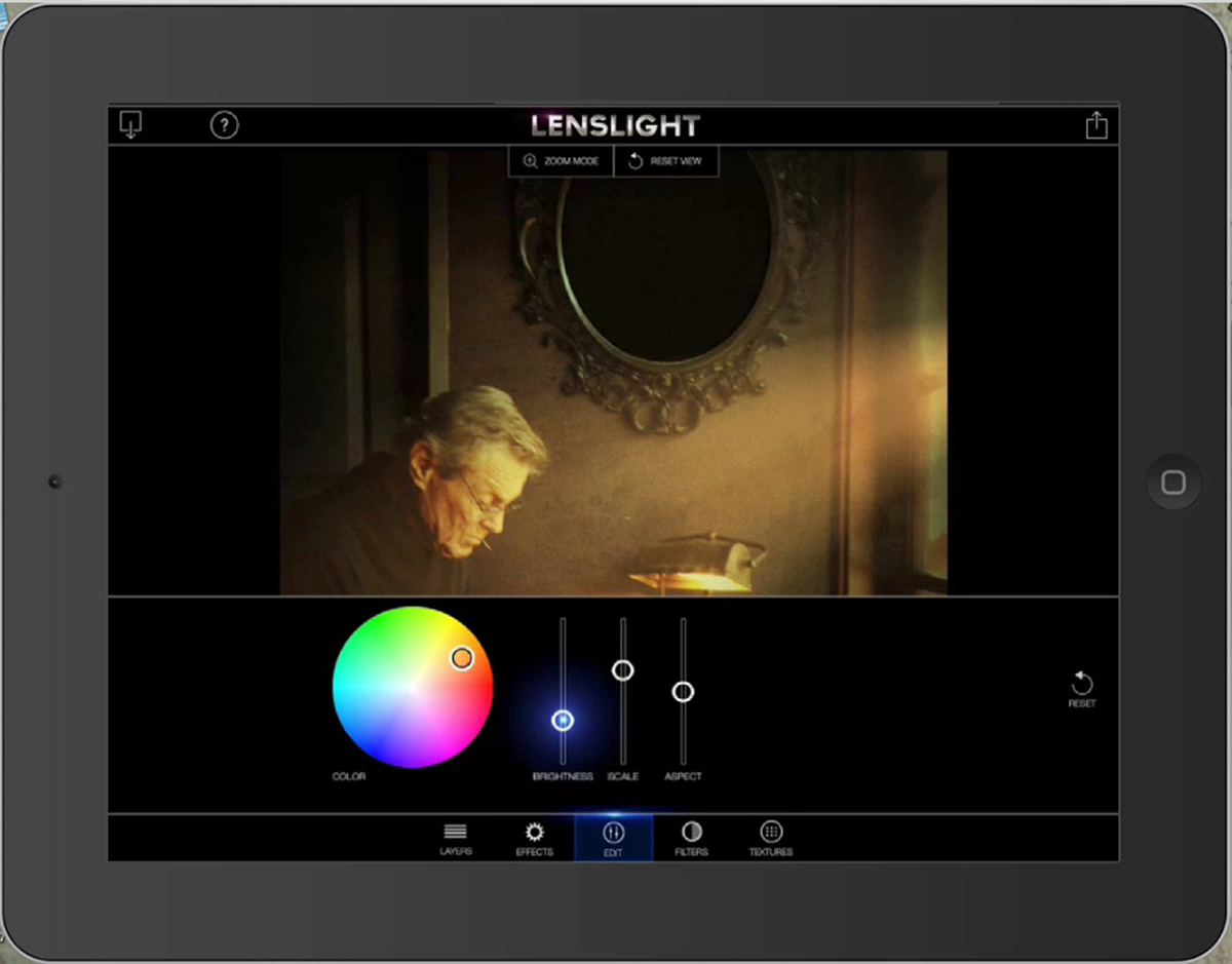
I then opened the image in Lenslight. The scene was already bathed in light from the window, but the colors were a bit washed out, and anyhow I wanted to boost the intensity of the morning rays coming through the window. Lenslight gives you the ability to add light rays of any color and intensity, while letting you adjust the angle and width. After some adjustment, I decided on light rays that only added a bit of additional punch to the existing light.
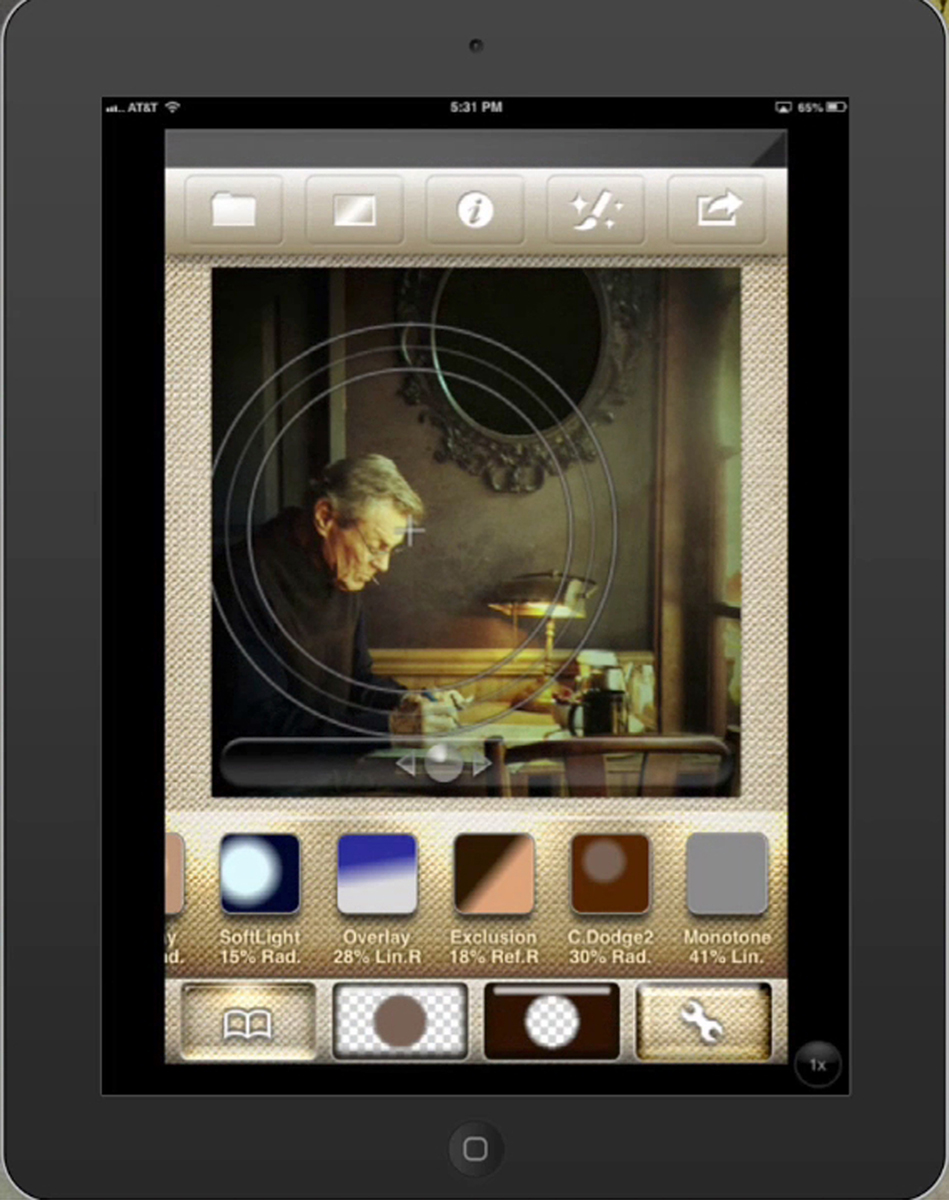
Step 8: Add some texture
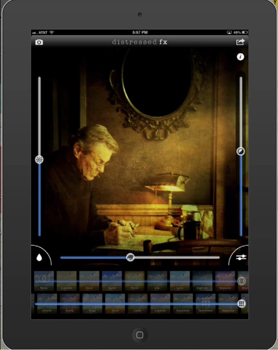
It seems that nearly every image benefits from texture, whether it’s film grain in a typical film-based photograph, or something that suggests the age of the substrate on which the image appears to be printed on. In this step you can see how I use DistressedFx – the fabulous app by texture producer Cheryl Tarrant – to give the scene some additional character. I settle on the Sentimental texture along the bottom row, and use the adjusters at the bottom and on both sides to alter the intensity and darken the scene a bit further.
Step 9: Final adjustments
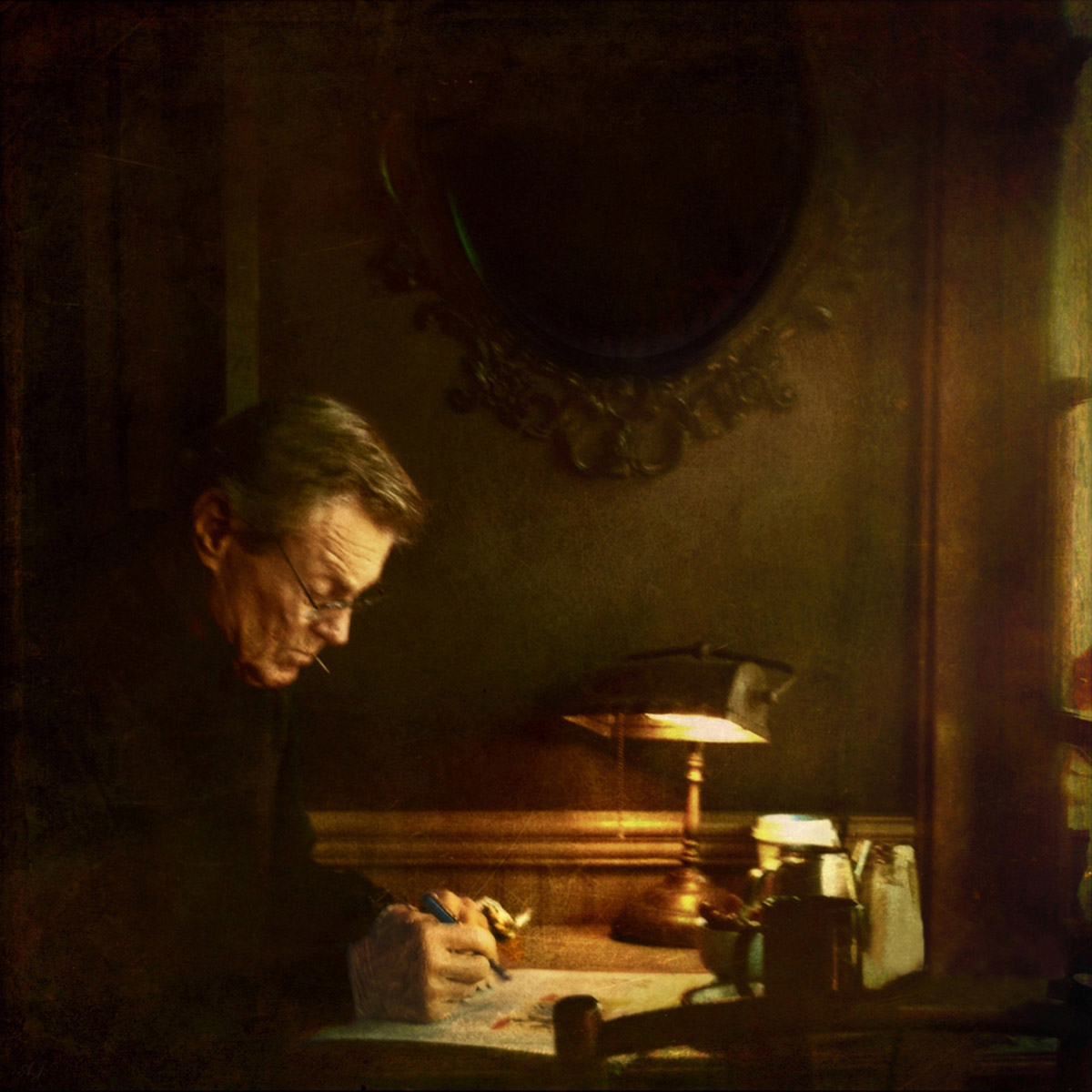
In a final step, not actually pictured here, I pull one of my favorite tricks to moderate an effect – again using Superimpose. I simply layer the pre-final image I created in the previous step over an earlier version of the scene to create a blend. I always save multiple versions of an image as I work, just in case I change my mind about a particular effect down the road – whether I prefer an earlier effect or a version without the most current effect. My final version reflects what I created in DistressedFX, but dialed back a bit by overlaying the immediately previous version in “Normal” blend mode to moderate the texture effect. And with that I called it done!